7. CLASSIFYING STARS
As described above, astronomers can now measure the distances of single stars out to about 1000 pc, their brightnesses, and hence can infer their luminosities (L). From their spectra, astronomers can infer the spectral types, or photospheric temperatures (T) of stars. Then, using the Stefan-Boltzmann Law they can infer their radii (R) from their temperatures and luminosities. If the stars are binaries, as many are, astronomers can also infer their masses (M) from observations of their orbits. These quantities -- L, T, R, and M, are intrinsic quantities. With many years of painstaking work, astronomers measure them for many thousands of stars. How then, do they make sense of all these measurements?
This problem is the same one faced by Charles Darwin when he arrived on the Galapagos Islands and found all sorts of strange birds and lizards, and by any botanist who begins to try to make sense out of the plants in a tropical forest. The answer is to begin organizing and classifying the information, a technique called taxonomy.
The first giant breakthrough in classifying stars was achieved independently by two astronomers, Einar Hertzsprung in Denmark, and Henry Norris Russell at Princeton University, around 1913. They plotted the locations of stars on a graph with the horizontal coordinate being spectral type (equivalent to temperature) and the vertical coordinate being absolute magnitude (equivalent to luminosity). The result, called the Hertzsprung-Russell diagram, or H-R diagram, is illustrated here. As you will learn in the next chapter, it was the first major clue to understanding how stars work.
Above is an H-R diagram of about 9000 fairly nearby stars with distances measured by the Hipparcos satellite. In this diagram the spectral type (or photospheric temperature) is represented by the ratio of star brightness as measured in two different filters, the B filter that is sensitive to blue light and the V filter that is sensitive to yellow light.
The most striking thing about the H-R diagram is that the locations of most (about 90%) of the stars on this diagram are clustered in a relatively thin curved band that stretches from the upper left to the lower right. This band is called the
main sequence. Main sequence stars have spectral types ending with the label V, indicating relatively low luminosity. For example, when we see from Table 17-5 that Sirius has spectral type AIV, we can conclude that it is a main sequence star. The stars at the upper left of the main sequence are hot (35,000 K) type O5 hot blue giant stars with luminosities more than 105 times that of the Sun, while those at the lower right are cool (3000 K) type M5 red dwarf stars with luminosities less than 10-4 times that of the Sun. The range in photospheric temperature is slightly more than a factor of 10, but the net range in luminosity is enormous -- more than 109 (1 billion)!Using the Stefan-Boltzmann Law, we can determine the radius of a star from its temperature and luminosity. For example, we know that the radii of the hottest blue giants are slightly more than ten times the Sun's radius, while the radii of the faintest red dwarfs are about 0.1 times the Sun's radius.
There seems to be a rule that most stars should belong to the main sequence, but about 10% of the stars are exceptions. So, classifying stars with the H-R diagram gives us two big questions: why do most stars obey such a rule; and why are some 10% of the stars exceptions to the rule? These simple questions led astronomers to an understanding of how stars live and die, as we shall learn in the next lessons.
Before we leave the H-R diagram, we should notice that most of the exceptional stars fall into two loose bunches. In the upper right of the diagram are the
red giant stars; with radii ranging up to more than 100 times the Sun's radius; they are the biggest stars on the diagram. On the lower left are the white dwarf stars; with radii less than 0.1 times the Sun's radius, they are the smallest stars on the diagram.We know the masses of many stars in binary systems, and for those stars we can organize the data in another way, called the
mass-luminosity relation, which is shown below. As the figure shows, the luminosity of main-sequence stars is closely correlated with their masses. The straight line in that diagram can be represented roughly by the equation L/LSun = (M/MSun)3.5. This equation implies that the luminosity of a main sequence star is extremely sensitive to its mass. For example, a star with mass 10 times that of the Sun will be roughly 103.5 = 3,000 times as luminous as the Sun. The most luminous known main sequence stars have masses about 50 times that of the Sun and luminosities about 106 times that of the Sun, while the least luminous ones have masses about 1/10th that of the Sun and luminosities about 10-3.5 times that of the Sun.
You can see that white dwarf stars have masses ranging from about 0.7 - 1.2 times that of the Sun, but luminosities ranging from 10-3 to 10-2 times that of the Sun. Red giant stars, on the other hand, have masses ranging from a few solar masses to perhaps 20 solar masses, and luminosities ranging from 100 to 105 solar luminosity units.
The main point of this figure is that main sequence stars, even though their luminosities span a range of more than 109 (one billion!), all seem to belong to the same family -- they obey the same rule. But red giants and white dwarfs march to a different drummer.
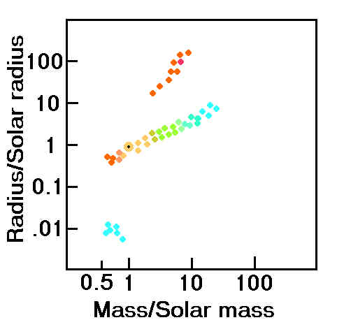
There is yet another way to organize the observations of binary stars, and that turns out to provide the best clue of all. That is to plot the locations of the stars in a
mass-radius diagram, shown above.|
|
|
Mass-radius diagram. The yellow dot with a black center denotes the Sun |
In such a diagram the main sequence stars again cluster about a narrow band, such that the radius of a star is nearly proportional to its mass [approximately,
R/RSun = (M/MSun)0.8 ]. Now, since the volume of a star is proportional to R3, the average density (mass divided by volume) is approximately proportional to M(1-3x0.8) = M-1.4. This argument shows that the main sequence blue giant stars are much less dense than the Sun.The red giant stars at the top of the diagram are even bigger than the blue giant stars, but less massive, so they have the lowest average densities. The white dwarf stars in the lower left, on the other hand, are very small but almost as massive as the Sun. The average density of a white dwarf star is about 1 ton per cubic centimeter!
(Return to course home page)
Last modified September 17, 2000
Copyright by Richard McCray