Creating a chart in Excel is easy. Simply select the two columns
of data you want to chart. (I do this by selecting the upper left
cell and holding the shift key down while I click on the lower right
cell.) The neither push the "chart wizard" button, ![]() ,
or go to the "Insert" pull-down menu and choose to insert a chart.You
will then be given a funny mouse icon. The next cell you select is
where he chart will be placed. Don't worry too much about placement
right now, the charts are easy to slide around and resize once
created. A chart "wizard" will then walk through the basic steps of
chart creation. The only places where you really need to pay
attention is when you must choose to make an "XY" scatter plot and
afterward whether or not to connect the points with a line (you don't
wnat to do this) or if you want to plot a grid on your graph (you
don;t want that either.) Other than that the wizard makes it
easy!
,
or go to the "Insert" pull-down menu and choose to insert a chart.You
will then be given a funny mouse icon. The next cell you select is
where he chart will be placed. Don't worry too much about placement
right now, the charts are easy to slide around and resize once
created. A chart "wizard" will then walk through the basic steps of
chart creation. The only places where you really need to pay
attention is when you must choose to make an "XY" scatter plot and
afterward whether or not to connect the points with a line (you don't
wnat to do this) or if you want to plot a grid on your graph (you
don;t want that either.) Other than that the wizard makes it
easy!
Now things can get a little sticky. Remember to refer to Excel's online help if you get totally lost.
The most important thing that you will want to do is change your symbol shape. Double click once to select your chart, then double click again on one of your symbols to open up a dialogue box that gives you a bewildering number of tabbed submenus for controlling your data groups. In "Patterns" you can change the sizes and shapes of the points, and in "Names and Values" you can change the name given in the legend on your chart. You should not need to change anything else.
This is relatively easy. Select the two columns of data you want to add to your chart. Now select copy from the "Edit" menu. Clcik on the chart and then go to the edit menu and select Paste Special. You should see the following dialogue box (or a similar one) pop open.
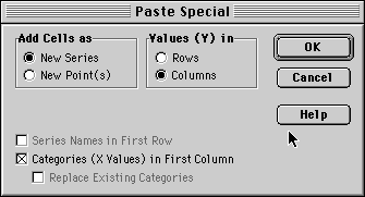
Be sure to have "New Series" selected!! This is how to make sure these new points are a distinct set from those already in the plot. Also, if you want the X-axis positions to be determined by the first column (which you probably do) make sure the appropriate box is checked. now you can double click on one of the new points and cusotmize the symbol and the legend name.
You can now customize your axis ranges sclaes and labels. At this point you can change pretty much anything in the plot by double clicking on the particlar bit you want to modify and exploring the resulting dialogue boxes. Just about everything you do this way you can undo if you don't like the result.
The undo command is "Command-z" on a mac (the command key is the one with the apple or the funny propellor symbol;) Usually right next to the space bar) ot "Control-z" on a PC. You can only undo the last thing you did, but don't panic if undo does not work for you. You can always pop open the same dialogue box again and try to change things back. The Scale tab in the "Format Axis" dialogue will let you control the scaling, the minimum and maximum ranges, where the other axis crosses the current axis and the direction the numbers go on the axis. The Patterns tab will let you fiddle with things like axis tick label placement. Pick sensible minimum and maximum ranges for your axes so that you dont cut out any data points but also so that your points aren't all smushed into one small area or edge of your plot.